THE DOGRUN
a place to share ideas


Playful Design
Posted by ddeleon on 2/12/13 at 5:09 pm
While in Pittsburgh, I had the opportunity to stop by the Children’s Museum. Once housed in the Old Post Office building, the museum expanded in 2004 taking full advantage of the nearby Buhl Planetarium.
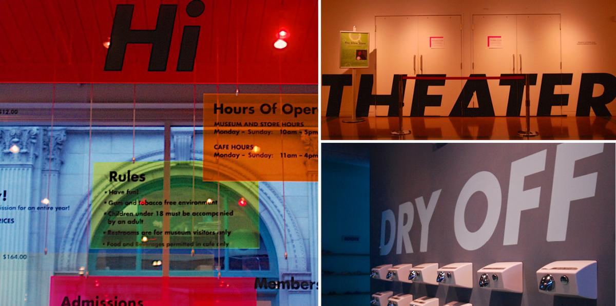
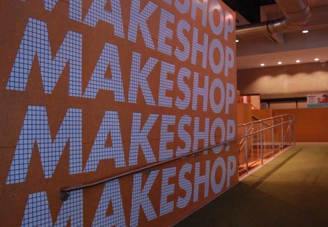
As a graphic designer, I was instantly drawn to wayfinding graphics (rather hard to miss). Pentagram’s use of scale and simplicity works effectively throughout the museum. Upon entering, I was immediately greeted by a colorful mix of plexiglass panels floating above the admissions desk. As I walked through the building, I felt as though I was in a children’s book- their solutions made sense at every turn I made.
 The graphics weren’t the only thing that impressed me. The interactive and hands-on exhibits engaged all of my senses; and navigating through the museum was just as fun as exploring all the exhibits.


 The graphics weren’t the only thing that impressed me. The interactive and hands-on exhibits engaged all of my senses; and navigating through the museum was just as fun as exploring all the exhibits.


