THE DOGRUN
a place to share ideas

The Lick List
Posted by jnieves on 9/24/13 at 1:31 pm
Ever feel so compelled by the experience of a building that you felt the need to lick it just to have a more complete experience of it? Me neither- that is until I read "The Eyes of the skin" by Juhani Pallasamaa. This book convinced me to begin the practice of licking buildings that were of a particular caliber. For example, some of the buildings my tongue has had the privilege of tasting include but are not limited to; the Pantheon, The Duomo in Florence, Jubilee Church, the Campanile in Venice and many more. With every stroke of the tongue another building would join "The Lick List". With this in mind I ventured to Dallas and Fort Worth to see three awesome museums designed by three awesome architects. These museums were the Kimbell Art Museum, the Modern Art Museum of Fort Worth and the Perot Museum.
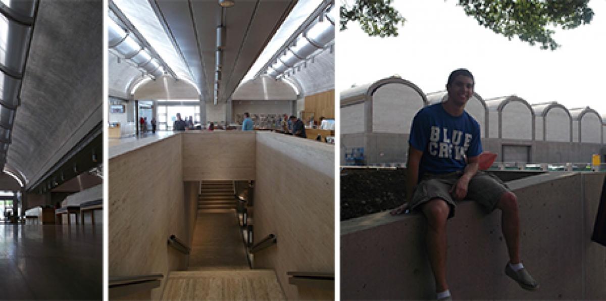
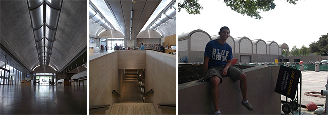 Kimbell Art Museum (Louis Kahn)
Interior/exterior
-The Kimbell was definitely designed from the inside out. No other building on the trip actually caused me to gasp when I entered. The naturally lit barrel vaults are scaled just right and illuminate the space without need for artificial lighting. While the interior of the Kimbell is truly breathtaking, the exterior is a direct result of the system set in place for the interior. Kahn takes a "it is what it is" and a "keep it simple stupid" mentality with the exterior. Some may see it as a military bunker but that's fine by me.
Schematic concept
-The KimbellArt Museum finds its organization under its barrel vaults. This system is extremely simple and allows equality amongst all the art exhibits and other spaces. One barrel for lobby, one for bookshop, one for cafe and so on. You get a barrel vault, and you get a barrel vault, EVERYONE GETS A BARREL VAULT!
Material Palette
-The Kimbell Art Museum is built of a hierarchy or materials. Concrete, the strongest and coldest material, is used to form the structure as well as the vaults. The texture of the aggregate catches the light bringing depth and life to the space. Travertine is used for the stair and walls maintaining a sense of strength but providing a texture that invites people to touch and feel the walls. The warmth and soft texture of wood is used whenever someone is expected to engage with an element like; bookshelves, furniture, sliding walls and doors.
Kimbell Art Museum (Louis Kahn)
Interior/exterior
-The Kimbell was definitely designed from the inside out. No other building on the trip actually caused me to gasp when I entered. The naturally lit barrel vaults are scaled just right and illuminate the space without need for artificial lighting. While the interior of the Kimbell is truly breathtaking, the exterior is a direct result of the system set in place for the interior. Kahn takes a "it is what it is" and a "keep it simple stupid" mentality with the exterior. Some may see it as a military bunker but that's fine by me.
Schematic concept
-The KimbellArt Museum finds its organization under its barrel vaults. This system is extremely simple and allows equality amongst all the art exhibits and other spaces. One barrel for lobby, one for bookshop, one for cafe and so on. You get a barrel vault, and you get a barrel vault, EVERYONE GETS A BARREL VAULT!
Material Palette
-The Kimbell Art Museum is built of a hierarchy or materials. Concrete, the strongest and coldest material, is used to form the structure as well as the vaults. The texture of the aggregate catches the light bringing depth and life to the space. Travertine is used for the stair and walls maintaining a sense of strength but providing a texture that invites people to touch and feel the walls. The warmth and soft texture of wood is used whenever someone is expected to engage with an element like; bookshelves, furniture, sliding walls and doors.
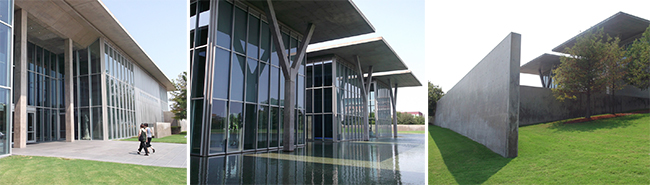 Modern Art Museum (Tadao Ando)
Interior/Exterior
-The interior/exterior relationships in the Ando museum were quite interesting. Nearly the whole building is surrounded by retaining walls that cut it off from pedestrian and street views. However once within the expansive lobby space the iconic view of the three heroic concrete "Y" columns rising from the reflecting pond can be viewed through floor to ceiling glass.
Schematic Concept
-The Ando Museum shares the idea of repetition with the Kimbell but within each of its three exhibit bars there is a more diverse layout to accommodate different art mediums and exhibits. Each bar has general art wall space on two floors and a special two story space that overlooks the reflecting pool.
Material Palette
-The Modern Art Museum is built predominately of concrete and glass which gives the building a super clean aesthetic, yet a cold feel. White washed walls and wood floors are used in some of the gallery space but I mostly spent my time looking out over the water. I'm not quite sure if water counts as a material but it was used as a large reflecting pool. Metal paneled exterior walls are used for the parking and entry facades, which in my opinion conveyed a much different feel to rest of the building. In the spirit of full disclosure, I was too distracted by the coolest Richard Serra sculpture, “Vortex” to even really notice what this portion of the building looked like.
Modern Art Museum (Tadao Ando)
Interior/Exterior
-The interior/exterior relationships in the Ando museum were quite interesting. Nearly the whole building is surrounded by retaining walls that cut it off from pedestrian and street views. However once within the expansive lobby space the iconic view of the three heroic concrete "Y" columns rising from the reflecting pond can be viewed through floor to ceiling glass.
Schematic Concept
-The Ando Museum shares the idea of repetition with the Kimbell but within each of its three exhibit bars there is a more diverse layout to accommodate different art mediums and exhibits. Each bar has general art wall space on two floors and a special two story space that overlooks the reflecting pool.
Material Palette
-The Modern Art Museum is built predominately of concrete and glass which gives the building a super clean aesthetic, yet a cold feel. White washed walls and wood floors are used in some of the gallery space but I mostly spent my time looking out over the water. I'm not quite sure if water counts as a material but it was used as a large reflecting pool. Metal paneled exterior walls are used for the parking and entry facades, which in my opinion conveyed a much different feel to rest of the building. In the spirit of full disclosure, I was too distracted by the coolest Richard Serra sculpture, “Vortex” to even really notice what this portion of the building looked like.
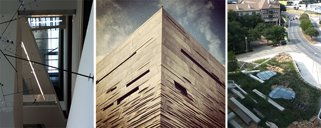 The Perot Museum (Morphosis)
Interior/Exterior
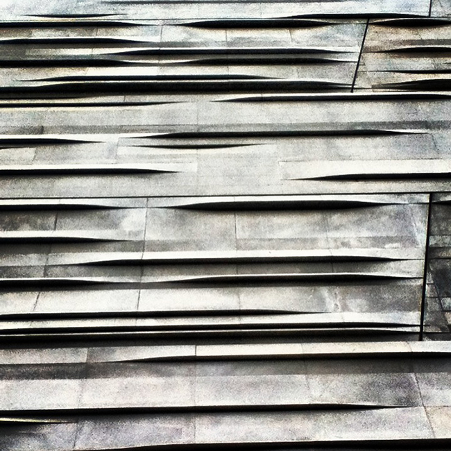
-The PerotMuseum was all about the exterior. The building has amazing street presence and is centrally located in downtown Dallas giving it far more visual prominence than the museums in Fort Worth. The buildings unique cladding system and first floor green roofed space bring the monolithic cube down to human scale. At the entrance there is also a mini kiddy park with water features that provide a fun space for kids to play. Being a natural history museum that caters more towards families and kids, the interior is far more playful and energetic than the straight lined precision of Kahn and Ando museums. The interior has very few windows and highlights the exhibit spaces more than the architecture. It is within the circulation core that you get excellent views to the green roof and the rest of downtown Dallas.
Schematic Concept
-The Perot Museum programming separates the exhibits – hosted in the cube - from the café and gift, which are located within a green-roofed single story element visible from every floor. Exhibits are organized vertically down the cube and are accessible from a crazy layout of elevators escalators and stairs that zig-zag around the circulation space.
Material Palette
-The Perot Museum also used concrete and glass but, unlike the Modern Art Museum, used them in a more playful manner which felt more inviting and warm. Views from the building were of naturally grown vegetative roofs and the city skyline, as opposed to the simplicity of Ando's reflecting pond. The concrete walls swirled around the exterior and interior that broke down the form’s scale, unlike the ordered symmetry of Kahn's barrels vaults.
The Perot Museum (Morphosis)
Interior/Exterior
-The PerotMuseum was all about the exterior. The building has amazing street presence and is centrally located in downtown Dallas giving it far more visual prominence than the museums in Fort Worth. The buildings unique cladding system and first floor green roofed space bring the monolithic cube down to human scale. At the entrance there is also a mini kiddy park with water features that provide a fun space for kids to play. Being a natural history museum that caters more towards families and kids, the interior is far more playful and energetic than the straight lined precision of Kahn and Ando museums. The interior has very few windows and highlights the exhibit spaces more than the architecture. It is within the circulation core that you get excellent views to the green roof and the rest of downtown Dallas.
Schematic Concept
-The Perot Museum programming separates the exhibits – hosted in the cube - from the café and gift, which are located within a green-roofed single story element visible from every floor. Exhibits are organized vertically down the cube and are accessible from a crazy layout of elevators escalators and stairs that zig-zag around the circulation space.
Material Palette
-The Perot Museum also used concrete and glass but, unlike the Modern Art Museum, used them in a more playful manner which felt more inviting and warm. Views from the building were of naturally grown vegetative roofs and the city skyline, as opposed to the simplicity of Ando's reflecting pond. The concrete walls swirled around the exterior and interior that broke down the form’s scale, unlike the ordered symmetry of Kahn's barrels vaults.
 It was interesting to see how very different these three museums were due to their varying program and age. Louis Kahn's geometrically ordered vaults reflects the strict and simple sophistication of classical art, while the Perot Museum demonstrates the excitement and technology of a contemporary science museum. Personally the Louis Kahn museum was my favorite but in the end I am happy to say that all three buildings made it on the lick list!
 Kimbell Art Museum (Louis Kahn)
Interior/exterior
-The Kimbell was definitely designed from the inside out. No other building on the trip actually caused me to gasp when I entered. The naturally lit barrel vaults are scaled just right and illuminate the space without need for artificial lighting. While the interior of the Kimbell is truly breathtaking, the exterior is a direct result of the system set in place for the interior. Kahn takes a "it is what it is" and a "keep it simple stupid" mentality with the exterior. Some may see it as a military bunker but that's fine by me.
Schematic concept
-The KimbellArt Museum finds its organization under its barrel vaults. This system is extremely simple and allows equality amongst all the art exhibits and other spaces. One barrel for lobby, one for bookshop, one for cafe and so on. You get a barrel vault, and you get a barrel vault, EVERYONE GETS A BARREL VAULT!
Material Palette
-The Kimbell Art Museum is built of a hierarchy or materials. Concrete, the strongest and coldest material, is used to form the structure as well as the vaults. The texture of the aggregate catches the light bringing depth and life to the space. Travertine is used for the stair and walls maintaining a sense of strength but providing a texture that invites people to touch and feel the walls. The warmth and soft texture of wood is used whenever someone is expected to engage with an element like; bookshelves, furniture, sliding walls and doors.
Kimbell Art Museum (Louis Kahn)
Interior/exterior
-The Kimbell was definitely designed from the inside out. No other building on the trip actually caused me to gasp when I entered. The naturally lit barrel vaults are scaled just right and illuminate the space without need for artificial lighting. While the interior of the Kimbell is truly breathtaking, the exterior is a direct result of the system set in place for the interior. Kahn takes a "it is what it is" and a "keep it simple stupid" mentality with the exterior. Some may see it as a military bunker but that's fine by me.
Schematic concept
-The KimbellArt Museum finds its organization under its barrel vaults. This system is extremely simple and allows equality amongst all the art exhibits and other spaces. One barrel for lobby, one for bookshop, one for cafe and so on. You get a barrel vault, and you get a barrel vault, EVERYONE GETS A BARREL VAULT!
Material Palette
-The Kimbell Art Museum is built of a hierarchy or materials. Concrete, the strongest and coldest material, is used to form the structure as well as the vaults. The texture of the aggregate catches the light bringing depth and life to the space. Travertine is used for the stair and walls maintaining a sense of strength but providing a texture that invites people to touch and feel the walls. The warmth and soft texture of wood is used whenever someone is expected to engage with an element like; bookshelves, furniture, sliding walls and doors.
 Modern Art Museum (Tadao Ando)
Interior/Exterior
-The interior/exterior relationships in the Ando museum were quite interesting. Nearly the whole building is surrounded by retaining walls that cut it off from pedestrian and street views. However once within the expansive lobby space the iconic view of the three heroic concrete "Y" columns rising from the reflecting pond can be viewed through floor to ceiling glass.
Schematic Concept
-The Ando Museum shares the idea of repetition with the Kimbell but within each of its three exhibit bars there is a more diverse layout to accommodate different art mediums and exhibits. Each bar has general art wall space on two floors and a special two story space that overlooks the reflecting pool.
Material Palette
-The Modern Art Museum is built predominately of concrete and glass which gives the building a super clean aesthetic, yet a cold feel. White washed walls and wood floors are used in some of the gallery space but I mostly spent my time looking out over the water. I'm not quite sure if water counts as a material but it was used as a large reflecting pool. Metal paneled exterior walls are used for the parking and entry facades, which in my opinion conveyed a much different feel to rest of the building. In the spirit of full disclosure, I was too distracted by the coolest Richard Serra sculpture, “Vortex” to even really notice what this portion of the building looked like.
Modern Art Museum (Tadao Ando)
Interior/Exterior
-The interior/exterior relationships in the Ando museum were quite interesting. Nearly the whole building is surrounded by retaining walls that cut it off from pedestrian and street views. However once within the expansive lobby space the iconic view of the three heroic concrete "Y" columns rising from the reflecting pond can be viewed through floor to ceiling glass.
Schematic Concept
-The Ando Museum shares the idea of repetition with the Kimbell but within each of its three exhibit bars there is a more diverse layout to accommodate different art mediums and exhibits. Each bar has general art wall space on two floors and a special two story space that overlooks the reflecting pool.
Material Palette
-The Modern Art Museum is built predominately of concrete and glass which gives the building a super clean aesthetic, yet a cold feel. White washed walls and wood floors are used in some of the gallery space but I mostly spent my time looking out over the water. I'm not quite sure if water counts as a material but it was used as a large reflecting pool. Metal paneled exterior walls are used for the parking and entry facades, which in my opinion conveyed a much different feel to rest of the building. In the spirit of full disclosure, I was too distracted by the coolest Richard Serra sculpture, “Vortex” to even really notice what this portion of the building looked like.
 The Perot Museum (Morphosis)
Interior/Exterior
-The PerotMuseum was all about the exterior. The building has amazing street presence and is centrally located in downtown Dallas giving it far more visual prominence than the museums in Fort Worth. The buildings unique cladding system and first floor green roofed space bring the monolithic cube down to human scale. At the entrance there is also a mini kiddy park with water features that provide a fun space for kids to play. Being a natural history museum that caters more towards families and kids, the interior is far more playful and energetic than the straight lined precision of Kahn and Ando museums. The interior has very few windows and highlights the exhibit spaces more than the architecture. It is within the circulation core that you get excellent views to the green roof and the rest of downtown Dallas.
Schematic Concept
-The Perot Museum programming separates the exhibits – hosted in the cube - from the café and gift, which are located within a green-roofed single story element visible from every floor. Exhibits are organized vertically down the cube and are accessible from a crazy layout of elevators escalators and stairs that zig-zag around the circulation space.
Material Palette
-The Perot Museum also used concrete and glass but, unlike the Modern Art Museum, used them in a more playful manner which felt more inviting and warm. Views from the building were of naturally grown vegetative roofs and the city skyline, as opposed to the simplicity of Ando's reflecting pond. The concrete walls swirled around the exterior and interior that broke down the form’s scale, unlike the ordered symmetry of Kahn's barrels vaults.
The Perot Museum (Morphosis)
Interior/Exterior
-The PerotMuseum was all about the exterior. The building has amazing street presence and is centrally located in downtown Dallas giving it far more visual prominence than the museums in Fort Worth. The buildings unique cladding system and first floor green roofed space bring the monolithic cube down to human scale. At the entrance there is also a mini kiddy park with water features that provide a fun space for kids to play. Being a natural history museum that caters more towards families and kids, the interior is far more playful and energetic than the straight lined precision of Kahn and Ando museums. The interior has very few windows and highlights the exhibit spaces more than the architecture. It is within the circulation core that you get excellent views to the green roof and the rest of downtown Dallas.
Schematic Concept
-The Perot Museum programming separates the exhibits – hosted in the cube - from the café and gift, which are located within a green-roofed single story element visible from every floor. Exhibits are organized vertically down the cube and are accessible from a crazy layout of elevators escalators and stairs that zig-zag around the circulation space.
Material Palette
-The Perot Museum also used concrete and glass but, unlike the Modern Art Museum, used them in a more playful manner which felt more inviting and warm. Views from the building were of naturally grown vegetative roofs and the city skyline, as opposed to the simplicity of Ando's reflecting pond. The concrete walls swirled around the exterior and interior that broke down the form’s scale, unlike the ordered symmetry of Kahn's barrels vaults.
 It was interesting to see how very different these three museums were due to their varying program and age. Louis Kahn's geometrically ordered vaults reflects the strict and simple sophistication of classical art, while the Perot Museum demonstrates the excitement and technology of a contemporary science museum. Personally the Louis Kahn museum was my favorite but in the end I am happy to say that all three buildings made it on the lick list!