THE DOGRUN
a place to share ideas

Energy Calendars
Posted by AHeisserer on 12/4/19 at 11:08 am
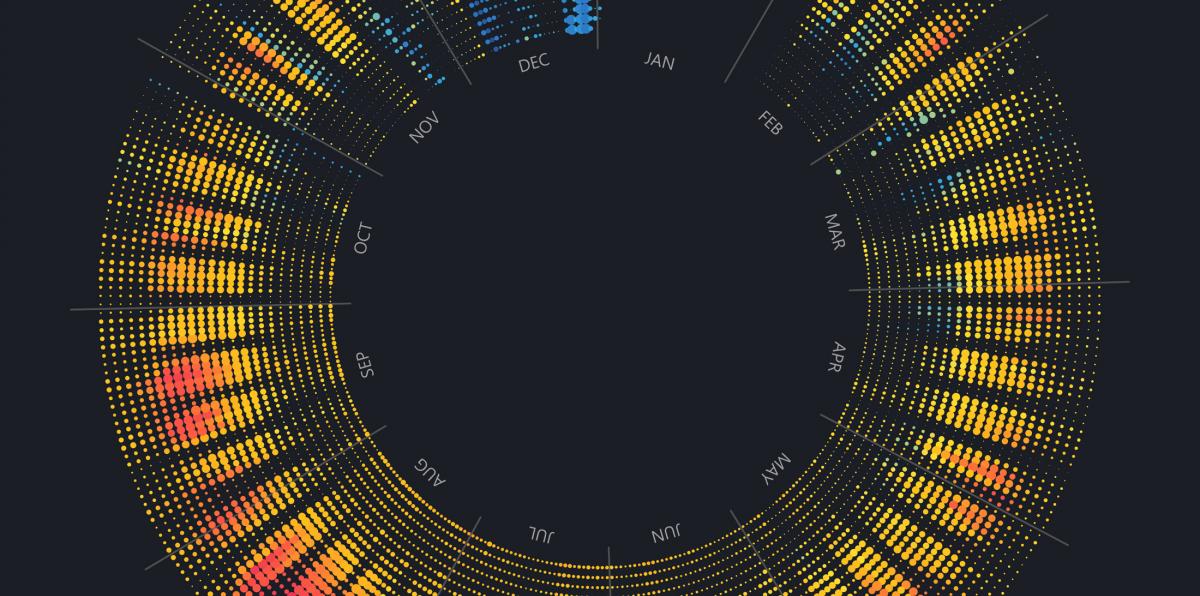
Each of these radial calendars represent one year of building energy use for a few different buildings that Lake Flato has studied in the past few years. Each dot represents one hour of energy use, with a larger dot indicating more energy used. The color of each dot represents the outside temperature, from 40°F in blue, to 90°F in red. Midnight is on the inside of the circle, with 11 pm on the outside.
Lake Flato monitors the energy use of several buildings as a means to learn more about how energy is actually used after a house or building is occupied. The energy use is often radically different from the energy model produced during design. This detailed energy data helps the architect and building owner identify sources of unexpected energy use and remediate the issues that arise.
When this data is displayed graphically, it reveals energy use patterns and anomalies that are not apparent from the numerical data alone. It also proves that every building is heavily influenced by those who operate it.
 Mesquite 2018: This is a net-zero energy house in San Antonio. This calendar indicates when the house is consuming more energy than it is producing. The calendar is empty during daylight hours when the solar array is producing more energy than is being used, creating the hollow band through the middle.
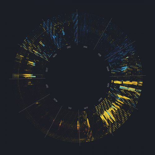 Josey 2015: This is the energy use for a small pavilion in North Texas. The highest energy is from well pumps being used during rain events. In this way, this calendar is roughly the inverse of it’s solar energy production calendar.
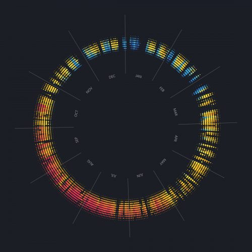 Josey Solar 2015: Rather than energy use, this calendar shows energy production from a solar array at a small pavilion in North Texas. Cloudy days interrupt solar production, and there are more daylight hours in the summer.
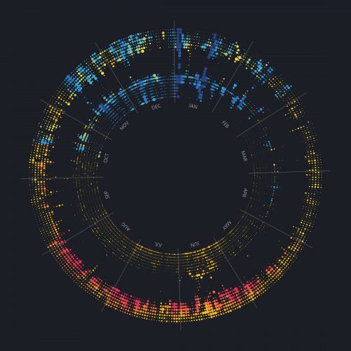
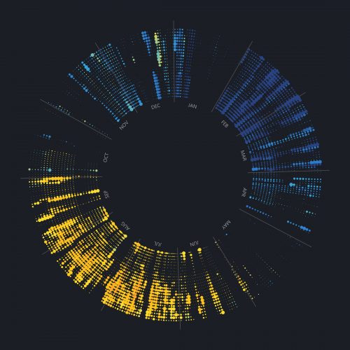 Long Island 2015: This house in Long Island, NY has a distinctive color range, indicating the colder outdoor temperatures compared to the other Texas projects. This is a part time home, mainly used in the spring and late summer of this year. The energy use is low when it’s not occupied.
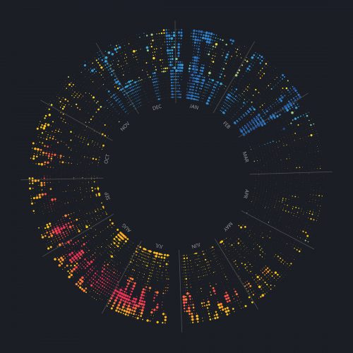 Pine 2015: This is a 100 year old house in San Antonio. Energy use is low, and a regular pattern of occupancy is visible. Heating and cooling loads stand out compared to the shoulder seasons.
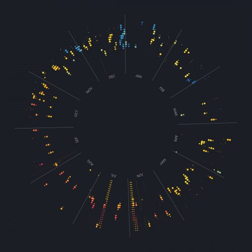 Pine Appliances 2015: This is data from the same house, showing only appliances.
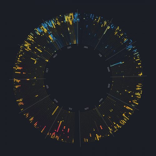 Pine Lights 2015: This is data from the same house, showing only lighting loads.
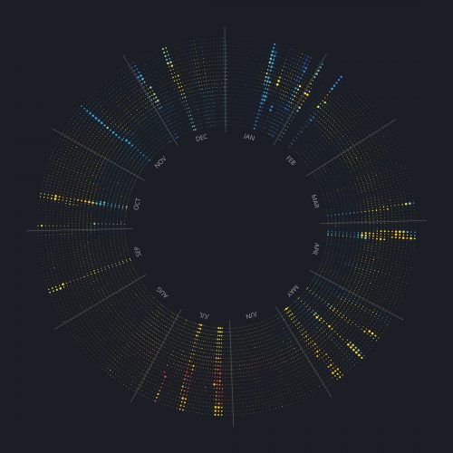 Fort Davis 2016: This is a net zero energy house in remote West Texas. It’s used occasionally, for a few days at a time. Energy use is relatively low and predictably tied to occupancy.
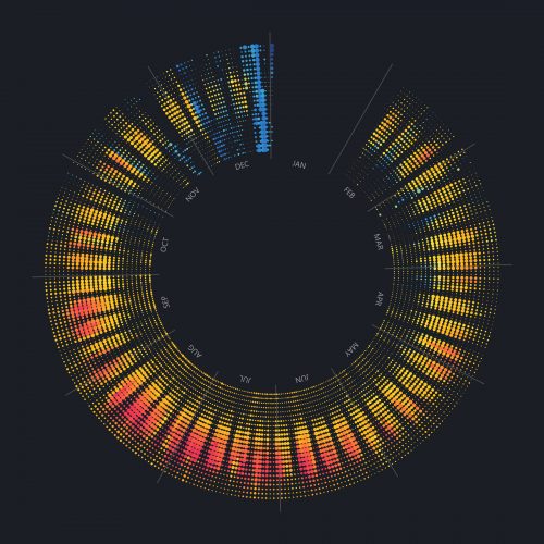 Third Street 2017 This is one floor of an office building in San Antonio. The eMonitor was installed in February, and a clear 5-day work week pattern is visible