THE DOGRUN
a place to share ideas

2016 Energy Calendars
Posted by AHeisserer on 1/20/17 at 8:37 pm
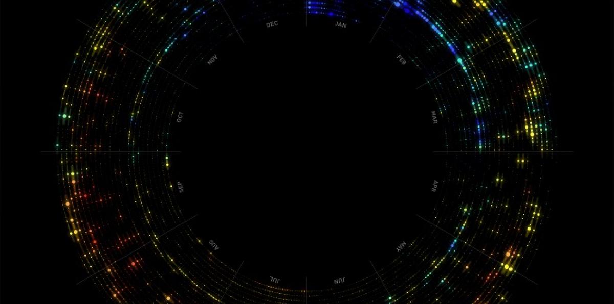
These six radial calendars show the energy-use patterns of six Lake Flato projects in 2016. The hourly data we collect from our eMonitors can be plotted into a single graphic with a Grasshopper script and reviewed to understand energy patterns and anomalies that wouldn't be apparent through numerical data alone.
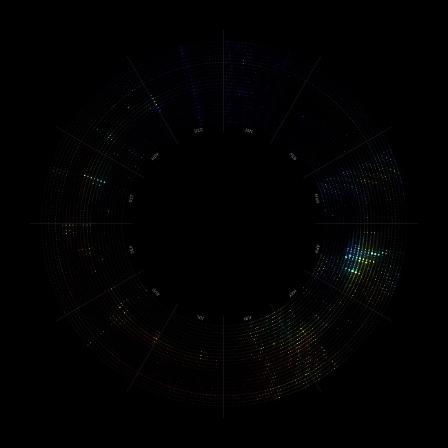
How to Read the Calendars
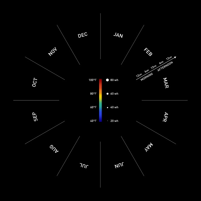 Each dot represents an hour of energy, and each row represents a day, moving from midnight on the inside of the circle to 11 pm on the outside. A dot with a larger radius means higher energy use, typically ranging from about 0 to 50 watt hours per hour. The dots are colored based on the outdoor temperature at the time, from 40 degrees F in blue, to 100 degrees F in red. The calendars read clockwise starting with January 1 at the top.
Two Full-Time Residences
Each dot represents an hour of energy, and each row represents a day, moving from midnight on the inside of the circle to 11 pm on the outside. A dot with a larger radius means higher energy use, typically ranging from about 0 to 50 watt hours per hour. The dots are colored based on the outdoor temperature at the time, from 40 degrees F in blue, to 100 degrees F in red. The calendars read clockwise starting with January 1 at the top.
Two Full-Time Residences
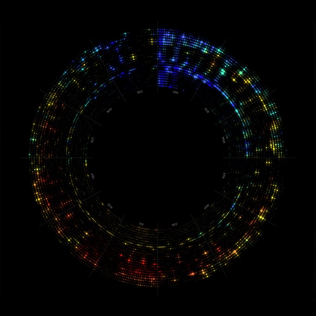 The above calendar is my apartment energy use at 1221 Broadway. I don't have an eMonitor, but CPS provides some residences with smart meters that record energy use data on 15 minute intervals. A string of energy use at the same time each morning is visible, followed by a larger band of use in the evening. Daytime use is mostly quiet, except on weekends. The color scale and heating loads reveal a milder winter in December 2016 compared to January 2016. Three energy gaps are visible for chicken-sitting in April, and two trips in July and December.
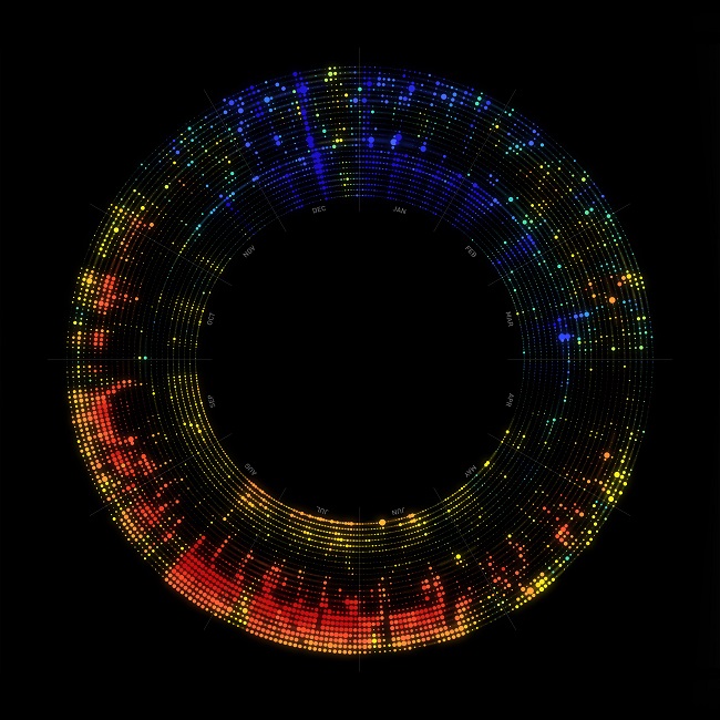 A small house on the east side of San Antonio, with a slightly larger area than my apartment and a leakier envelope. Air conditioning loads are most visible during occupied hours through the summer. Setbacks on weekdays keep daytime HVAC loads down. Heating loads peak on December 18, the coldest day of the year.
Two Part-Time Residences
A small house on the east side of San Antonio, with a slightly larger area than my apartment and a leakier envelope. Air conditioning loads are most visible during occupied hours through the summer. Setbacks on weekdays keep daytime HVAC loads down. Heating loads peak on December 18, the coldest day of the year.
Two Part-Time Residences
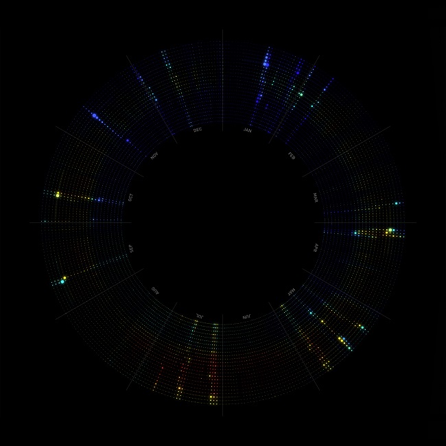 In this part-time residence in the Davis Mountains of West Texas, it's very clear when the house is occupied for a few days at a time. Temperatures are noticeably cooler than San Antonio, and energy use is extremely low when unoccupied except for a few small phantom loads.
 This part-time house, north of Austin, has visibly higher unoccupied loads and high HVAC loads, particularly during summer days and winter nights. The eMonitor stopped recording data for a few days in October.
Two Commercial Buildings
This part-time house, north of Austin, has visibly higher unoccupied loads and high HVAC loads, particularly during summer days and winter nights. The eMonitor stopped recording data for a few days in October.
Two Commercial Buildings
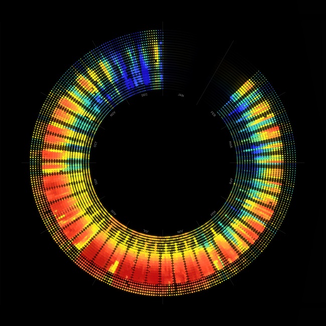 This medium-sized office headquarters in San Antonio reveals a typical commercial-use pattern; energy use picks up around 8 am slows down consistently around 6 pm, with a very visible 5-day work week occasionally broken by holidays such as Memorial Day and Thanksgiving. This eMonitor was installed mid-February, Lake Flato's first eMonitor on a project of this scale. This graphic had to be re-scaled to be legible. The graphic at the same scale as our other residential projects can be seen below:
 The same office headquarters at the same scale as the others in this post.
 The Dixon Water Foundation Josey Pavilion is an open-air pavilion in Decatur, Texas. A solar array produces more energy than is used, making the Josey Pavilion a net-positive energy building. Energy use from water treatment peaked in mid-April during the heaviest rains of the year. Energy loads are very low for the remainder of the year.
 Plotting energy generation from the solar array reveals a ring of solar energy produced during daylight hours. Days lengthen from about 7 hours of production in the winter to 11 hours mid-summer. The same rain event that caused high water pump use in April also limited solar energy production due to heavier cloud cover. Low cloud cover and long days through the summer make it the most productive time of year.
Each dot represents an hour of energy, and each row represents a day, moving from midnight on the inside of the circle to 11 pm on the outside. A dot with a larger radius means higher energy use, typically ranging from about 0 to 50 watt hours per hour. The dots are colored based on the outdoor temperature at the time, from 40 degrees F in blue, to 100 degrees F in red. The calendars read clockwise starting with January 1 at the top.
Two Full-Time Residences
The above calendar is my apartment energy use at 1221 Broadway. I don't have an eMonitor, but CPS provides some residences with smart meters that record energy use data on 15 minute intervals. A string of energy use at the same time each morning is visible, followed by a larger band of use in the evening. Daytime use is mostly quiet, except on weekends. The color scale and heating loads reveal a milder winter in December 2016 compared to January 2016. Three energy gaps are visible for chicken-sitting in April, and two trips in July and December.
A small house on the east side of San Antonio, with a slightly larger area than my apartment and a leakier envelope. Air conditioning loads are most visible during occupied hours through the summer. Setbacks on weekdays keep daytime HVAC loads down. Heating loads peak on December 18, the coldest day of the year.
Two Part-Time Residences
In this part-time residence in the Davis Mountains of West Texas, it's very clear when the house is occupied for a few days at a time. Temperatures are noticeably cooler than San Antonio, and energy use is extremely low when unoccupied except for a few small phantom loads.
This part-time house, north of Austin, has visibly higher unoccupied loads and high HVAC loads, particularly during summer days and winter nights. The eMonitor stopped recording data for a few days in October.
Two Commercial Buildings
This medium-sized office headquarters in San Antonio reveals a typical commercial-use pattern; energy use picks up around 8 am slows down consistently around 6 pm, with a very visible 5-day work week occasionally broken by holidays such as Memorial Day and Thanksgiving. This eMonitor was installed mid-February, Lake Flato's first eMonitor on a project of this scale. This graphic had to be re-scaled to be legible. The graphic at the same scale as our other residential projects can be seen below:
The same office headquarters at the same scale as the others in this post.
The Dixon Water Foundation Josey Pavilion is an open-air pavilion in Decatur, Texas. A solar array produces more energy than is used, making the Josey Pavilion a net-positive energy building. Energy use from water treatment peaked in mid-April during the heaviest rains of the year. Energy loads are very low for the remainder of the year.
Plotting energy generation from the solar array reveals a ring of solar energy produced during daylight hours. Days lengthen from about 7 hours of production in the winter to 11 hours mid-summer. The same rain event that caused high water pump use in April also limited solar energy production due to heavier cloud cover. Low cloud cover and long days through the summer make it the most productive time of year.