THE DOGRUN
a place to share ideas

Lick List: Austin
Posted by jnieves on 6/3/14 at 2:10 pm
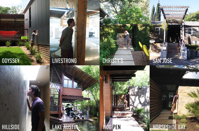
As I have mentioned in a previous post, during school my roommates and I adopted the tasty practice of licking great buildings from Juhani pallasmaa. This past weekend I was able to put my tongue to the test as the office embarked on a trip up to Austin to see a number of projects that we have designed and boy did I get a mouthful!
A big thank you to Robert Lingo, who flawlessly organized the excursion with help from Patrick Burnham and a few others. It was an excellent chance to see our work up close and get to experience the evolution of Lake|Flato’s design throughout the years. It was amazing to see how each project’s unique site, program and client needs influenced such a variety of design and yet how each project was still built on the principles of place, environment and thoughtful design. With so many great projects came so many licks!
 2001 Odyssey Porch House
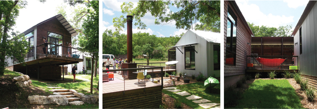
2001 Odyssey, the smallest project of the trip, felt much larger than expected due to the organization of its modules. The placement of the modules create a variety of outdoor spaces including: a deck around the outdoor fire place, two covered porches/hammock niches, a stone patio and a bocce ball court down the hill. My personal favorite architectural moment at Odyssey is how the main living module soars out of grade and cantilevers out toward the trees, creating a treehouse-like deck that looks out toward the Blanco River below. The house truly takes advantage of the site’s unique properties and is beautifully sited right on the edge of the tree-line and hill weaving the house seamlessly into the landscape.
Element licked: Corrugated Metal Siding (nice and toasty)
 Livestrong Foundation
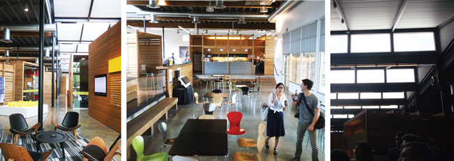
The most sustainable building is the one you don’t have to build. I’m a true believer in this idea and the Livestrong Foundation is an incredible example of sustainability through adaptive reuse. Through very thoughtful and careful planning, the once dark, windowless warehouse was redeveloped into a naturally lit and dynamic space. The center portion of the warehouse roof was carved out and opened to the sky with a series of North facing saw-tooth skylights bringing the ever changing environment into the office. All of the material removed from the roof was not discarded, but instead given new life by recycling the wood for the conference room pods that are scattered throughout the office. These crate-like-pods not only provide space for meeting rooms and lounges but are also organized in a way that influences the circulation, bringing a quirky and dynamic office flow that feels more like a streetscape than an office building. The structural beams removed from the roof were reused for benches and seating in the loading dock-turned-kitchen/assembly space.
Element Licked: Wooden Slat (didn’t really have a flavor)
 Christy Ten Eyck’s Landscape Wonderland
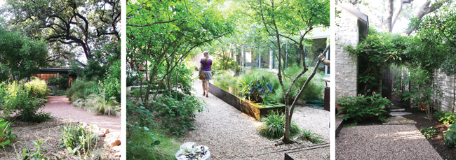
Just before the trip began we were generously invited to visit Christy Ten Eyck’s house for a Saturday afternoon happy hour. Christy is an incredibly talented landscape architect that our office has had the pleasure of working with on a number of projects. Her house is a true testament to her genius and understanding of outdoor space and landscape design. The entry sequence takes you on a journey through a thicket of beautiful vegetation where you get only a glimpse of the house beyond as you make your way through the meandering garden path. Once at the side yard, you pass through a braided metal gate and the journey continues as every space has its own unique characteristics which make for a yard that can accommodate a variety of meeting spaces. No nook or cranny went overlooked. Every piece of land was thoughtfully designed and utilized.
Element licked: Rusted Metal Gate (hopefully my tetanus shots are up to date)
 Hotel San Jose
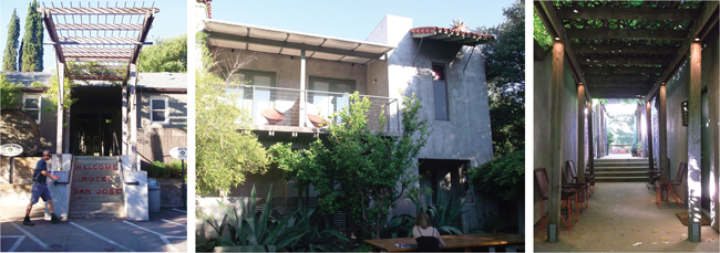
After a long day of exploring projects, we settled down for a lounge at the pool and a few drinks at the Hotel San Jose. This project was a renovation of an old hotel on South Congress Street that had a lot of potential but needed a little help. It has been years since the project was completed and today it is a much sought out oasis covered in vines and shaded from the hot Texas sun. Garden pathways sneak around the buildings creating a multitude of quiet courtyards that provide a much needed break from the busy streets outside. A few lucky LFers booked a stay at the hotel here— I was not so fortunate....
Element Licked: Wooden Column (no splinters!)
 Hog Pen Creek Residence
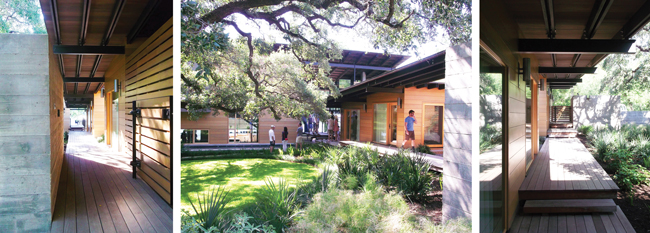
The Hog Pen Creek Residence sits just off the water of Lake Austin, nestled around a few beautiful live oak trees and the Hog Pen Creek that curves around the North end of the site providing a private courtyard and buffer from neighbors. The house is organized along an axial boardwalk that leads all the way from the entry motor court, past the guest wing, bridges over the 75’ lap pool, passes through the entry dogrun and out to the water and lake pavilion. This axial boardwalk draws you down toward the water and becomes the ultimate linking element in the project. The materials and details of the house are impeccable and the house is full of fun little surprises: the master bedroom roller door, a second story catwalk that leads to a glass office, a cantilevered staircase out to the boat dock and the furniture built from a recovered pecan tree that fell on site during a storm early in construction. No element went unnoticed and the house is properly tailored to fit the client’s needs.
Element Licked: Board-formed Concrete wall (slightly gritty)
 Lake Austin Residence
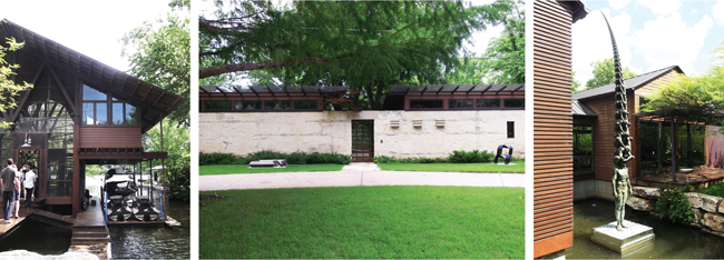
No other house on the tour was quite attuned to its natural surroundings as the Lake Austin Residence. Due to the narrow site, water was pulled into the land through the extension of a natural inlet where the house is split up and placed alongside the water reflecting the design of an old Japanese fishing village. An axial boardwalk, similar to the one at the Hog Pen Creek Residence, runs alongside the water and through the entry screened porch linking both arrival by land and water. The street entrance is a simple stone wall with the most enticing slat gate door that gives just a glimpse of the property beyond. The guest houses foreshadow the later realized idea of porch house with their elegantly detailed and simple gabled design. These help emphasize the main entry screened porch which takes center stage as the most architecturally expressive moment of the house, with its iconic wooden trusses and floating office space. Sitting in the double height screened porch you get views both east to the lake as well as West back down the boardwalk all while the soothing ripples of water can be heard just outside. The house has also been adorned with a most impressive art collection by the owners who pride their home as a work of art in itself.
Element licked: Exterior wooden column (tasted like a wood column on a lake...)
 Hillside House
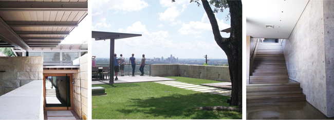
The Hillside house is perched way up high over Austin providing breathtaking views of downtown. In order to best capture this view, the house was thoughtfully composed in a way that provided maximum glazing toward downtown in every space it could. Not only do the interior spaces get this treatment but also the exterior where a grass roof overtop the kids wing allows the owner to entertain on a large lawn complete with a swimming pool and deck which all get to take in the sights of downtown. Upon entry the house seems appropriately scaled with heavy stone walls providing adequate privacy and small courtyards for views from the bedrooms. Fun elements in the house include: the large entry pivot door, beautiful snap-tie concrete walls and an outdoor trellis and fireplace.
Element Licked: Snap-Tie Concrete wall (super smooth!)
 Horseshoe Bay Residence
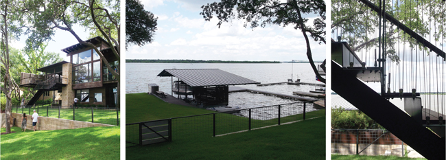
The Horseshoe Bay Residence was without a doubt the coziest house on the tour. The material palette of dark stained wood and stone gives the house a homey and almost cottage-like feel. The interior walls are white-washed wooden siding which helps push the farm house aura. Clever sliding walls and bird blind screening elements bring a thoughtful charm to the residence and fun stair and railing details express the uniqueness of the house. This lake house has amazing views to Lake LBJ and the location of the screened and covered porches off to the side of the house not only provide the main living space with uninterrupted views, but also takes advantage of the prevailing winds that come from the water. The lower level is complete with a fun bunk room for kids, a relaxing den and probably the most comfortable nap spot of the trip.... a hammock!
Element Licked: Stone Wall (quite gritty)
 Walls Lake House
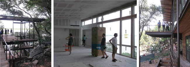
Just a short walk down the street from the Horseshoe Bay Residence, we got the opportunity to check out one of the offices more unique houses which is currently under construction. The Walls Lake House sits at the base of a steep hill and the program stacks vertically three floors to best capture the expansive views of Lake LBJ over the trees. This super tree house — once finished— will have the ultimate party porch which cantilevers out 12 feet into the canopy of a nearby tree and has a bridge that takes you out to grade on the slope where a future fire pit will be located. It was truly exciting to get to experience the house prior to completion and have an opportunity to see and learn from the process of construction.
Lick List criteria calls for all buildings in question must be fully built to be considered worthy of licking. Due to this projects current status it may not be licked until completion. Stay tuned!
 Shout out to our amazing clients who generously opened their homes for us! The work this office does wouldn’t be what it is without you!!!
 2001 Odyssey Porch House
2001 Odyssey, the smallest project of the trip, felt much larger than expected due to the organization of its modules. The placement of the modules create a variety of outdoor spaces including: a deck around the outdoor fire place, two covered porches/hammock niches, a stone patio and a bocce ball court down the hill. My personal favorite architectural moment at Odyssey is how the main living module soars out of grade and cantilevers out toward the trees, creating a treehouse-like deck that looks out toward the Blanco River below. The house truly takes advantage of the site’s unique properties and is beautifully sited right on the edge of the tree-line and hill weaving the house seamlessly into the landscape.
Element licked: Corrugated Metal Siding (nice and toasty)
 Livestrong Foundation
The most sustainable building is the one you don’t have to build. I’m a true believer in this idea and the Livestrong Foundation is an incredible example of sustainability through adaptive reuse. Through very thoughtful and careful planning, the once dark, windowless warehouse was redeveloped into a naturally lit and dynamic space. The center portion of the warehouse roof was carved out and opened to the sky with a series of North facing saw-tooth skylights bringing the ever changing environment into the office. All of the material removed from the roof was not discarded, but instead given new life by recycling the wood for the conference room pods that are scattered throughout the office. These crate-like-pods not only provide space for meeting rooms and lounges but are also organized in a way that influences the circulation, bringing a quirky and dynamic office flow that feels more like a streetscape than an office building. The structural beams removed from the roof were reused for benches and seating in the loading dock-turned-kitchen/assembly space.
Element Licked: Wooden Slat (didn’t really have a flavor)
 Christy Ten Eyck’s Landscape Wonderland
Just before the trip began we were generously invited to visit Christy Ten Eyck’s house for a Saturday afternoon happy hour. Christy is an incredibly talented landscape architect that our office has had the pleasure of working with on a number of projects. Her house is a true testament to her genius and understanding of outdoor space and landscape design. The entry sequence takes you on a journey through a thicket of beautiful vegetation where you get only a glimpse of the house beyond as you make your way through the meandering garden path. Once at the side yard, you pass through a braided metal gate and the journey continues as every space has its own unique characteristics which make for a yard that can accommodate a variety of meeting spaces. No nook or cranny went overlooked. Every piece of land was thoughtfully designed and utilized.
Element licked: Rusted Metal Gate (hopefully my tetanus shots are up to date)
 Hotel San Jose
After a long day of exploring projects, we settled down for a lounge at the pool and a few drinks at the Hotel San Jose. This project was a renovation of an old hotel on South Congress Street that had a lot of potential but needed a little help. It has been years since the project was completed and today it is a much sought out oasis covered in vines and shaded from the hot Texas sun. Garden pathways sneak around the buildings creating a multitude of quiet courtyards that provide a much needed break from the busy streets outside. A few lucky LFers booked a stay at the hotel here— I was not so fortunate....
Element Licked: Wooden Column (no splinters!)
 Hog Pen Creek Residence
The Hog Pen Creek Residence sits just off the water of Lake Austin, nestled around a few beautiful live oak trees and the Hog Pen Creek that curves around the North end of the site providing a private courtyard and buffer from neighbors. The house is organized along an axial boardwalk that leads all the way from the entry motor court, past the guest wing, bridges over the 75’ lap pool, passes through the entry dogrun and out to the water and lake pavilion. This axial boardwalk draws you down toward the water and becomes the ultimate linking element in the project. The materials and details of the house are impeccable and the house is full of fun little surprises: the master bedroom roller door, a second story catwalk that leads to a glass office, a cantilevered staircase out to the boat dock and the furniture built from a recovered pecan tree that fell on site during a storm early in construction. No element went unnoticed and the house is properly tailored to fit the client’s needs.
Element Licked: Board-formed Concrete wall (slightly gritty)
 Lake Austin Residence
No other house on the tour was quite attuned to its natural surroundings as the Lake Austin Residence. Due to the narrow site, water was pulled into the land through the extension of a natural inlet where the house is split up and placed alongside the water reflecting the design of an old Japanese fishing village. An axial boardwalk, similar to the one at the Hog Pen Creek Residence, runs alongside the water and through the entry screened porch linking both arrival by land and water. The street entrance is a simple stone wall with the most enticing slat gate door that gives just a glimpse of the property beyond. The guest houses foreshadow the later realized idea of porch house with their elegantly detailed and simple gabled design. These help emphasize the main entry screened porch which takes center stage as the most architecturally expressive moment of the house, with its iconic wooden trusses and floating office space. Sitting in the double height screened porch you get views both east to the lake as well as West back down the boardwalk all while the soothing ripples of water can be heard just outside. The house has also been adorned with a most impressive art collection by the owners who pride their home as a work of art in itself.
Element licked: Exterior wooden column (tasted like a wood column on a lake...)
 Hillside House
The Hillside house is perched way up high over Austin providing breathtaking views of downtown. In order to best capture this view, the house was thoughtfully composed in a way that provided maximum glazing toward downtown in every space it could. Not only do the interior spaces get this treatment but also the exterior where a grass roof overtop the kids wing allows the owner to entertain on a large lawn complete with a swimming pool and deck which all get to take in the sights of downtown. Upon entry the house seems appropriately scaled with heavy stone walls providing adequate privacy and small courtyards for views from the bedrooms. Fun elements in the house include: the large entry pivot door, beautiful snap-tie concrete walls and an outdoor trellis and fireplace.
Element Licked: Snap-Tie Concrete wall (super smooth!)
 Horseshoe Bay Residence
The Horseshoe Bay Residence was without a doubt the coziest house on the tour. The material palette of dark stained wood and stone gives the house a homey and almost cottage-like feel. The interior walls are white-washed wooden siding which helps push the farm house aura. Clever sliding walls and bird blind screening elements bring a thoughtful charm to the residence and fun stair and railing details express the uniqueness of the house. This lake house has amazing views to Lake LBJ and the location of the screened and covered porches off to the side of the house not only provide the main living space with uninterrupted views, but also takes advantage of the prevailing winds that come from the water. The lower level is complete with a fun bunk room for kids, a relaxing den and probably the most comfortable nap spot of the trip.... a hammock!
Element Licked: Stone Wall (quite gritty)
 Walls Lake House
Just a short walk down the street from the Horseshoe Bay Residence, we got the opportunity to check out one of the offices more unique houses which is currently under construction. The Walls Lake House sits at the base of a steep hill and the program stacks vertically three floors to best capture the expansive views of Lake LBJ over the trees. This super tree house — once finished— will have the ultimate party porch which cantilevers out 12 feet into the canopy of a nearby tree and has a bridge that takes you out to grade on the slope where a future fire pit will be located. It was truly exciting to get to experience the house prior to completion and have an opportunity to see and learn from the process of construction.
Lick List criteria calls for all buildings in question must be fully built to be considered worthy of licking. Due to this projects current status it may not be licked until completion. Stay tuned!
 Shout out to our amazing clients who generously opened their homes for us! The work this office does wouldn’t be what it is without you!!!
