THE DOGRUN
a place to share ideas

Better Know an L|F Project: 311 Third Street
Posted by graceboudewyns on 2/18/13 at 1:46 pm
The Story:
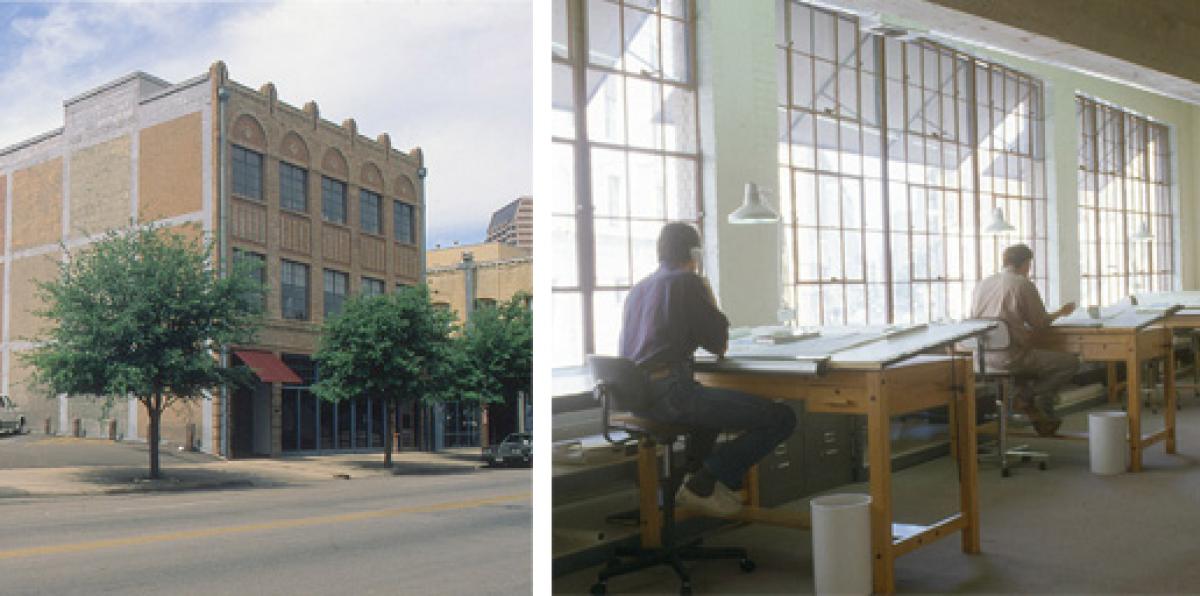
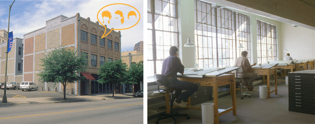
Our building was built in 1920, originally designed for a Hupmobile dealership selling electric cars. Previous tenants include a black gospel radio station, a law firm, an investment banking firm, and interior design firm. At one time, the FBI also occupied the garage. Sprinkle-Robey designed the notorious “egg” for a graphic design firm that once occupied the first floor south studio. In 1985, David and Ted bought partial ownership in the building, and started Lake|Flato Architects on the south side of the second floor. The firm expanded to the second floor north side in 1990, the third floor in 2003 (when T+D took full ownership), and the entire first floor in 2005. In 2008 we completed a full renovation of the main level.
Answers by: Brian Korte and Vicki Yuan
LF Scope: Everything related to finish out since we first occupied the building in 1985.
Completion Date:
The last renovation was completed in 2008, but in reality it will never be “complete”. The office is an ever-changing environment that gets altered or updated to suit our needs and to stay current with technology…we are continually growing within the constraints of the building. Perhaps one day we will need a penthouse?
 The Crux of the Design:
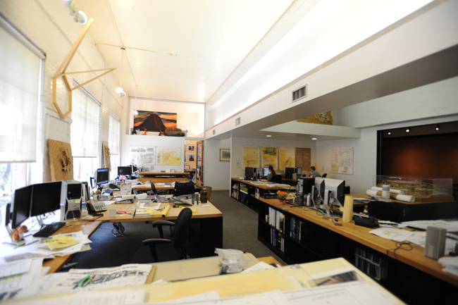
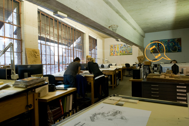
The three story building is 50’ wide by 100’ long by 50’ tall, and each floor follows the same simple diagram: a core of conference rooms and support spaces with open studios on the north and south ends, where original steel windows provide generous daylight and views for the shared work zone. The free spanning concrete beams of the original parking structure allow the interior space to be flexible without bearing walls, creating a transparent, casual environment perfectly suited with Lake|Flato’s collaborative studio culture. The separation of studios within the building also lends a smaller scale to the office, a growing firm of 60+ people.
Favorite Details:
 Interesting Material:
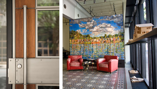
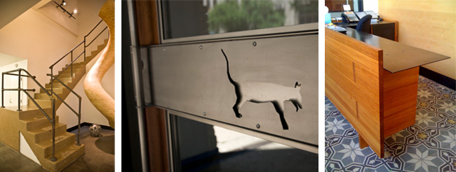
Whenever possible we always try to celebrate the honesty of materials and structure: for the third floor renovation we sandblasted the paint off the concrete beams to expose the material, and for the main level renovation, we cleaned and refinished the original concrete mission tile in the lobby. When we need to add new elements, we have an undying love affair with blackened steel, complemented by reclaimed long leaf pine used for custom furnishings. Another interesting material used throughout the conference rooms are the floating tectum ceilings - someone came in the other day and commented on how we made an acoustic ceiling look pretty.
If you could change one thing . . .
Where to start…! Sometimes our strongest asset is simultaneously our biggest weakness - we love the original character of our parking structure-turned-office, but the building envelope is anything but high performing. For example, the industrial steel windows are beautiful yet terribly leaky.
I’d also love a local coffee shop to occupy the small rental building on the corner of our parking lot.


 The Crux of the Design:
The three story building is 50’ wide by 100’ long by 50’ tall, and each floor follows the same simple diagram: a core of conference rooms and support spaces with open studios on the north and south ends, where original steel windows provide generous daylight and views for the shared work zone. The free spanning concrete beams of the original parking structure allow the interior space to be flexible without bearing walls, creating a transparent, casual environment perfectly suited with Lake|Flato’s collaborative studio culture. The separation of studios within the building also lends a smaller scale to the office, a growing firm of 60+ people.
Favorite Details:
- custom Metalmorphosis fabricated entry door
- 10KW photovoltaic array on garage roof!
- integrated Malou Flato painting of the firm at Kickapoo Ranch
- Matt Morris cityscape painting integrated into storefront window frame
- Riley Robinson “Double Helix” CNC cut plywood sculpture in stairwell
- custom design reception desk, entry table, kitchen shelf
- Jim Smith’s color blocks on the exterior facades

 Interesting Material:
Whenever possible we always try to celebrate the honesty of materials and structure: for the third floor renovation we sandblasted the paint off the concrete beams to expose the material, and for the main level renovation, we cleaned and refinished the original concrete mission tile in the lobby. When we need to add new elements, we have an undying love affair with blackened steel, complemented by reclaimed long leaf pine used for custom furnishings. Another interesting material used throughout the conference rooms are the floating tectum ceilings - someone came in the other day and commented on how we made an acoustic ceiling look pretty.
If you could change one thing . . .
Where to start…! Sometimes our strongest asset is simultaneously our biggest weakness - we love the original character of our parking structure-turned-office, but the building envelope is anything but high performing. For example, the industrial steel windows are beautiful yet terribly leaky.
I’d also love a local coffee shop to occupy the small rental building on the corner of our parking lot.
